Intended level and assumed knowledge: We figure you know a little about probability, a little about R, a little about hypothesis testing and statistics. We’d like to show you how these fit together. If you’re unfamiliar with these concepts, the footnotes will be your guide (some of the time).
And so it begins..
Our location: an office somewhere in Sydney, Australia. It might be well-appointed corporate digs, a slightly underfunded academic building or a cheap cafe somewhere in central Sydney. Choose your own statistical adventure.1
John: Where do you want to start Steph?
Steph: I don’t know, John. I have a lot of pent up rage. Let’s break something.
John: We both know you have issues, Steph. We could take a stab2 at making sense of the reproducibility of experiments, prediction, and pre-registration? Even better, we could take a stab at truth.
Steph: Literally?
John: Figuratively. We could look at hypothesis testing. We planned to do something useful, remember?
Steph: OK, let’s break a hypothesis test. But these concepts are all really complex. Explain it like … I’m a management consultant. There should be a powerpoint and a snappy title.
John: No chance. I’ll explain it like I’m a professor of statistics.
Steph: My way is funnier. You and Microsoft SmartArt. Just give me five minutes to put a bet down with your grad students.
John: My way at least makes sense and has an actual point.
Steph: Fair call. OK, go!
John: Alright, it started a few years ago. People started looking into whether particular bits of medical research were reproducible. In particular Ioannidis (2005) tried to reproduce 49 famous medical publications from 1990-2003 resulting from randomized trials: 45 claimed successful intervention;
- 7 (16%) were contradicted;
- 7 others (16%) found effect sizes were exaggerated;
- 20 (44%) were replicated; and
- 11 (24%) remained largely unchallenged.
John: There were a number of other papers too, like Pashler and Wagenmakers (2012). The common theme between all of these papers, statistically speaking, is hypothesis testing.
One approach to fixing this problem is to pre-register hypothesis testing procedures.
Steph: This plan was not dreamed up by management consultants. Why did they take that approach?
John: Well people tended to play around with their analysis by playing games with statistics to get statistical significance (usually \(p\)-values below 0.05). Pre-registration is the idea that forces researchers to pre-specify how they will analyse their data before they collect it to stop this from happening.
Steph: And yet we do it all the time with exploratory analysis.
John: But causal inference needs a different approach.
Steph: I agree, but as the person who wanted to stab a theoretical concept earlier in this conversation, I can think of a whole bunch of ways this can go wrong.
John: Exactly. It’s really imperfect, but I think it would help to explain why that’s the case.
Steph: You know what this dialogue needs, John?
John: You’re going to tell me, whether I want to hear it or not.
Steph: Relateable examples, mate.3
John (thinks): OK so a few years ago my wife was rear-ended while driving and the car was written off so we needed to buy a new car. While we were looking to get a new car my sister in law asked (as a joke) “Are you getting a red car? I heard they’re fast!”

John: Now I don’t know much about cars at all. So if I went into a car yard I wouldn’t want to buy one that looked like this.
Steph: Honestly, John, it’s really not your style. You’re totally not doing the whole mid life crisis thing.
John: Fast cars are also expensive cars! But that’s not the point.
Steph: Your midlife crisis is not the point?
John: I’m not having a midlife crisis.
Steph: You’re an academic statistician who just started a blog with a management consultant.
John: My judgement is lacking sometimes. There’s a point to this post though- I wanted to look at a bunch of ways to mess around with hypothesis tests in order to get them to break.
My first example related to my sister in law’s joke.
By break I mean that the results of the hypothesis test are misleading - I want to create a situation where the test is telling us there is a difference between two things when in fact no difference exists in reality.
Steph: Bayesians. Let’s do this, let’s break some hypothesis tests. I might be the frequentist in this conversation, but the fact is that inference is really, really breakable in the field, so I think this is inherently useful. Bring on the cars!
Red cars are faster!4
Let’s imagine a simplified world, such as is suitable for management consultants and students of statistics:
Suppose that5
There are only two car colours - red cars and blue cars and we describe them with the variable \(\mbox{colour}_i\);
Cars can eiher be sports cars or normal cars; and we represent them with the variable \(\mbox{type}_i\);
Sports cars are more likely to be red than normal cars
Sports cars are generally faster than normal cars.
The relationship between the three variables can be visualized by a directed acyclic graph.6
There are three nodes: type, colour and speed. The car type “causes”
the car colour and the car speed so there is a directed
edge from type to colour and type to speed. We can visualize this
using the dagitty and ggdag packages (Textor and van der Zander 2016,@R-ggdag).
library(dagitty)
library(ggdag)

dagified <- dagify(colour ~ type,
                   speed ~ type,
                   exposure = "colour",
                   outcome = "speed")
ggdag(dagified, layout = "circle")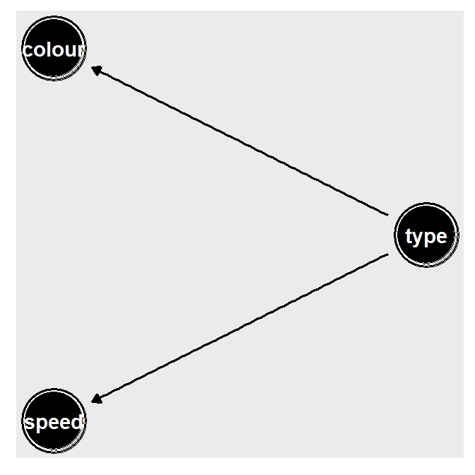
Figure 1: DAG for speed, colour and type
Steph: That was all a bit mathy, but the general upshot is that we created a little facsimile of the world, one in which there are two types of cars (sports and normal), two colours of cars (blue and red) and cars have a speed that depends on their type. Then we represented it with some circles and lines that describe what those relationships are.
Simulating data
Let’s put some numbers around this to create a concrete example: something measurable that we can test, and then show how and where a hypothesis test can (and does) get it wrong.
Let’s say that each type of car is equally likely:
\[ \begin{array}{rl} {\mathbb P}( \mbox{sports car} ) = 0.5 \\ {\mathbb P}( \mbox{normal car} ) = 0.5 \\ \end{array} \]
Next, let’s say that the probability of a sports car being red is higher than for a normal car.7
\[ \begin{array}{rl} {\mathbb P}( \mbox{red car} | \mbox{sports car} ) & = 0.8, \\ {\mathbb P}( \mbox{blue car} | \mbox{sports car} ) & = 0.2, \\ {\mathbb P}( \mbox{red car} | \mbox{normal car} ) & = 0.2, \qquad \mbox{and} \\ {\mathbb P}( \mbox{blue car} | \mbox{normal car} ) & = 0.8. \\ \end{array} \]
Finally, suppose that normal cars travel on average \(\beta_0 = 100\)km/h, with sports cars travelling on average \(\beta_1 = 50km/h\) higher, with the same standard deviation of \(\sigma=25\)km/h.8
Now, say there are lots of cars in the world. Statistics is usually about understanding patterns in repeated things. Then we can simulate the speed of the \(i\)th car, where \(i\) is just any arbitrary car, as:
\[ \begin{array}{rl} \mbox{speed}_i & = \beta_0 + \beta_1 \times {\mathbb I}(\mbox{type}_i=\mbox{sports}) + \varepsilon_i \\ & = 100 + 50 \times {\mathbb I}(\mbox{type}_i=\mbox{sports}) + \varepsilon_i \end{array} \] where independently \(\varepsilon_i \sim N(0,25^2)\).9
Steph: John, you know that some people exist who are allergic to maths, right? So to translate, you made up a situation where the speed of the car is only is related to the colour of the car because red cars are more likely to be sports cars.
John: Exactly, and this is going to be relevant later.
Let’s simulate some data10 that captures this scenario using R (R Core Team 2018).
# Specify true values of parameters - these are just the numbers we chose above
prob_sport <- 0.5
prob_red_given_sport  <- 0.8
prob_red_given_normal <- 0.2
beta0  <- 100
beta1  <- 50
sd_Val <- 25
n_cars <- 50

# Simulate car type
type <- rbinom(n_cars,1,prob_sport)

# Calculate colour probabilities according to type
prob_colour <- ifelse(type,prob_red_given_sport,prob_red_given_normal)

# Simulate car colours - we're using the binomial distribution for that
colour <- rbinom(n_cars,1,prob_colour)

# Simulate car speeds - we decided on the normal above
speed <- beta0 + beta1*type + rnorm(n_cars,sd=sd_Val)

# Convert to tibble and make categories readable
tib <- tibble(colour, speed) %>%
  mutate(
    colour=factor(
        ifelse(colour,"red","blue"),
          levels=c("red","blue")
        )
)Steph: Car type - where’s the car type?
John: We’re going to break this hypothesis test by dropping an important variable.
Steph: Breaking, just like I asked for. Great. I note we’re breaking frequentist stuff first.
John: We’re also simulating a podcast here, for reasons unknown.
Boxplots and two sample t-tests11
Now that we have simulated some data we can create boxplots to get a view of the differences between the cars. Then we can try some statistical tests. If we make a boxplot for speed against colour we get:
p <- ggplot(tib, aes(x=colour, y=speed, fill=colour)) +
  geom_boxplot() +
  theme_bw()
p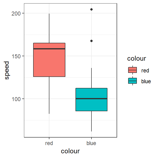
Figure 2: speed vs colour
We can see that there appears to be a clear difference between the speeds of red and blue cars from the boxplots.
Steph: If we saw this result in exploratory analysis in the field, this would be our signal to keep digging. And that’s where domain knowledge wins every time, John. At this point in a real piece of field work, as a corporate data scientist, I want my analysts to be jumping up and down at me telling me this isn’t a real causal effect.
John: That’s true, this is a simulated, simplified reality. Out of interest, do they often jump up and down when you’re around?
Steph: I run a high energy team. Let’s pretend like we don’t understand that there isn’t a real relationship between speed and colour. Let’s say we don’t understand the causal relationships between the variables and we go ahead and do a test.
To quantify the difference a two sample \(t\)-test could be used.
We have two sets of points - one for red cars, one for blue cars:
\[ {\bf r} = (r_1,\ldots,r_n) \qquad \mbox{and} \qquad {\bf b} = (b_1,\ldots,b_m), \] these correspond to the speeds of the red and blue cars respectively.12
We assume that both the \({\bf r}\) and \({\bf b}\) samples are normally distributed: \[ r_i \stackrel{iid.}{\sim} N(\mu_1,\sigma^2), \qquad \mbox{and} \qquad b_i \stackrel{iid.}{\sim} N(\mu_2,\sigma^2) \] where the index ranges are \(i=1,\ldots,n\) and \(i=1,\ldots,m\), \(\mu_1\) and \(\mu_2\) are the mean speeds of the red and blue cars respectively, and \(\sigma^2\) is a common variance parameter.13
Let’s take a hypothesis test of the form \[ H_0 \colon \mu_1 = \mu_2 \qquad \mbox{versus} \qquad H_1 \colon \mu_1 > \mu_2 \] where we have chosen a one sided alternative to indicate our prior belief that red cars are faster than blue cars.
Steph: What that means is we have a conservative belief that, eh, maybe our two types of cars have the same average speed. This is the null hypothesis, the thing we’re beating up against. We’re going to test that against the alternative hypothesis that actually the red cars are faster on average. We choose to test that they are faster, because that’s the hypothesis we identified earlier with John’s sister in law: red cars are faster.
If we wanted to see if red cars were significantly faster than
blue cars we could perform a \(t\) test using the
tadaatoolbox package (Burk and Anton 2018).14
library(tadaatoolbox)
tadaa_t.test(data=tib,
             response=speed,
             group=colour,
             direction="greater",
             print="markdown")
Table 1: Two Sample t-test with alternative hypothesis: \(\mu_1 > \mu_2\)
| Diff | \(\mu_1\) red | \(\mu_2\) blue | t | SE | df | \(CI_{95\%}\) | p | Cohen's d | Power |
|---|---|---|---|---|---|---|---|---|---|
| 40.12 | 145.98 | 105.86 | 4.15 | 9.66 | 48 | (23.92 - Inf) | < 0.001 | 1.2 | 0.99 |
And voila, we have a p-value < 0.05. We reject the null hypothesis in favour of an alternative where red cars are faster.
We got statistical significance, which we’d expect because we set up our little universe that way. Fantastic, it worked like we thought it might! (Just not Steph’s development environment).
Steph: But the problem is we know that the colour of the car does not make for a fast car. The hypothesis test is performed correctly, under perfect conditions - but our understanding of causality is totally flawed and as a consequence it’s entirely misleading.
John: Exactly. But statistics is about making inferences into a broader population. We had one caryard in our little facsimile of reality. We really need to understand if this could happen more than once - if it’s a generalisable result. Otherwise it’s just an interesting anomaly.
Steph: Always with the generalising. But I agree. Interesting anomalies are rarely any use to me in the field or in the corporate world. I would need to understand whether this test is fundamentally broken, for all the cars. Or if it’s a fluke.
Reproducibility, prediction and inference
Suppose that we went to a number of “car yards” (i.e., repeated the experiment) where data was generated using the above process and we only observed:
the speed of the cars and the
the colour of the cars.
Suppose that we repeated the experiment 1000 times, that is we went to 1000 car yards15 and performed the same two sample t-test on different collected samples at each car yard collecting data for \(n=50\) different cars each time.16
How often would red cars be significantly faster than blue car if we were to repeat the same experiment over and over again, i.e., would our results be reproducible?
n_car_yards <- 1000

p_values <- c()
for (i in 1:n_car_yards)
{
  # Simulate car type
  type <- rbinom(n_cars,1,prob_sport)

  # Calculate colour probs
  prob_colour <- ifelse(type,prob_red_given_sport,prob_red_given_normal)

  # Simulate car colours
  colour <- rbinom(n_cars,1,prob_colour)

  # Simulate car speeds
  speed <- beta0 + beta1*type + rnorm(n_cars,sd=sd_Val)

  # Perform two-sample t-test
  p_values[i] <- t.test(speed[colour==1],
                        speed[colour==0],
                        alternative="greater")$p.value
}
From the above simulations we find that in 94.1 percent of simulations where red cars were statistically significantly faster than blue cars even though the colour of the car has nothing to do with the speed of the car. This is a generalisable result, not a fluke.
So…
Reproducibility: The results would be reproducible roughly 94.1 percent of the time since if we went from car yard to car yard red cars would be generally faster than blue cars. Pre-registration does not inherently solve this problem of a spurious relationship between these variables.
Prediction: Even though there is no direct relationship between speed and car colour, if we were to pick a car that we wanted to be fast then we would pick a red car and the car would be more likely to be faster than if we picked a blue car. We can still make good predictions from incorrect models.17
- Truth: Painting our car red would not make it any faster.
Steph: Congratulations John, statistics has discovered the age-old econometric problem of the spurious regression. We broke that hypothesis because we were measuring the wrong relationships.18
John: Yes, that was my point - with a relateable example. It occurs all the time in science. Researchers don’t know what the true relationship between measurements are so they
measure what their current theory tells them what is important to measure;
measure what it is possible or convenient to measure; or
measure a whole bunch of stuff and hope that something they measure is important.
Steph: This happens in business all.the.time. You think you’re measuring Thing A, when actually Thing B is what’s doing the heavy lifting and Thing B just happens to be correlated with Thing A. Tylyer Vigen’s site is full of examples of this in real life, in those cases, time itself is the common Thing B. If you’re working with time series it’s often inevitable if you don’t recognise the impact it has.
John: Stories for another day?
Steph: Sure- next time let’s see what this idea of a spurious relationship would look like in a real-world data science context.
Acknowledgements: We would like to thank Sarah Romanes, Isabella Ghement, and Shila Ghazanfar for proof-reading and comments.
Barrett, Malcolm. 2018. Ggdag: Analyze and Create Elegant Directed Acyclic Graphs. https://CRAN.R-project.org/package=ggdag.
Burk, Lukas, and Tobias Anton. 2018. Tadaatoolbox: Helpers for Data Analysis and Presentation Focused on Undergrad Psychology. https://CRAN.R-project.org/package=tadaatoolbox.
Ioannidis, John P. A. 2005. “Contradicted and Initially Stronger Effects in Highly Cited Clinical Research.” JAMA 294 (2): 218–28.
Pashler, Harold, and Eric–Jan Wagenmakers. 2012. “Editors’ Introduction to the Special Section on Replicability in Psychological Science: A Crisis of Confidence?” Perspectives on Psychological Science 7 (6): 528–30.
R Core Team. 2018. R: A Language and Environment for Statistical Computing. Vienna, Austria: R Foundation for Statistical Computing. https://www.R-project.org/.
Textor, Johannes, and Benito van der Zander. 2016. Dagitty: Graphical Analysis of Structural Causal Models. https://CRAN.R-project.org/package=dagitty.
On our Twitter post announcing this blog, Steph made a comment about a would-be podcast, except she and John are the parents of five young kids between them (not together, we hasten to add). Consider this the ‘could have been’ podcast.↩
Australian slang for try.↩
At this point, Steph attempted to compile this post for the first time. John, we need to talk about dependencies one of these days.↩
Now I’ve had to make a version update to R itself, John. I’m just saying, if you ever had to put code into production…↩
For the record, this proof is John’s but Steph had time to take all the math-speak away while trying to update all those dependencies. Y’all can thank me later.↩
Some maths help: This is basically just choose your own adventure, but for probability. The subscript \(i\) just refers to a specific, generic car - it could be anything, red or blue, sport a normal soccer mum mobile full of junk.↩
Some maths help: These are what we call conditional probabilities, the idea that if Thing 1 happens, then Thing 2 may be more or less likely as a result. This makes sense if you think about sports at all (neither John or Steph follow sport, but we hear that normal people often quite like it) - the probability of team A winning the sportsball grandfinal might be 50% overall. This is the marginal probability. But the probability that Team A wins the sportsball grandfinal given Team B’s star player mysteriously won free first class tickets to Las Vegas may be 90%. This is the conditional probability. We signify that with the | sign - so \(P(thing 1 | thing 2)\) means ‘the probability of thing 1 happening, given thing 2 happens as well’.↩
Some maths help: This is clearly another fantasy, a simplifying assumption. Using this we can start placing numbers on our facsimile of the real world, measure the effects and then proceed to our test.↩
Some maths help: The \(I\) function is what’s called an indicator function. It’s equal to a 1 if the condition inside the bracket is true and a zero if it’s not. So the speed of the \(i\)th car is \(150 + \varepsilon_i\) if it’s a sports car, but if it’s just a normal, rather dirty car full of empty happy meal boxes, it’s \(100 + \varepsilon_i\)↩
For those of you following along on this epic adventure, Steph is now reinstalling the entire
tidyverse. On a mobile phone hotspot.↩Am now reinstalling all dependencies of ggplot2, we better break something real good, John.↩
Some maths help: those \(r\)s and \(b\)s you can really just think of as a list of all the relevant points. Or, even better - they’re just two columns in a spreadsheet, one marked “red cars” the other is marked “blue cars”. The \(n\) and the \(m\) just refers to the length of each of those columns. They could have the same number of observations, or different. \(m\) could be 20 and \(n\) could be 25. Or 200 and 250 or 20000 and 25000. The idea of the maths here is to generalise. Whenever you see mathematics like this, that’s all it’s doing - generalising to the point where you could throw any number in there at all.↩
Some maths help: Yep, John’s generalising again here. All he’s trying to say is that the two car speeds could have any mean, but they have a common variance. So they have the same shape of the bell curve, but it’s sitting in a different spot. If you’re wondering what that might look like, check out this app.↩
As a corporate data scientist who is currently working through dependency hell, I legit use these tests all.the.time.↩
Steph would prefer to stab herself in the hand with a fork than do this, just saying.↩
The idea here is that we have very little certainty about one observation, one car yard, but about many observations we can be more certain. And if anybody has any idea why this build is Failed with error: ‘package ’ggplot2’ could not be loaded’, I’d be eternally grateful.↩
Steph’s note: Alot of seriously good field work is based around understanding this, working within the limitations it creates and acknowledging these. But understanding the domain is always critical to doing this successfully.↩
I admit defeat, can’t work out the dependency issue, John hit me up with your dependencies and system environment please!↩